| Hi-Quality Digitally Printed & Shipped in 1 Day | Indoor/Outdoor Use up to 3 Years | ||
| Premium 13 ounce Vinyl Banner Material | Waterproof & UV Protected | ||
| Options Available: Hemming, Grommets, Pole Pockets, Wind Slits | |||
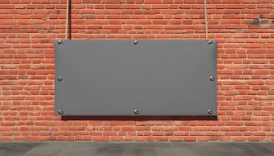
Custom Gray Banners | Vinyl Banner Printing
Need a Banner with a Gray Background? Order Now . . .
Gray banners hold a unique place in the world of design and marketing. Often seen as a neutral and balanced color, gray can convey a range of emotions and messages, making it a versatile choice for various applications. From subtle elegance to modern sophistication, gray can be used effectively in numerous settings to achieve specific goals.
Color Psychology and Impact
 Meaning and Symbolism of the Color Gray
The color gray is often associated with neutrality, balance, and calmness. It sits between the extremes of black and white, embodying a sense of compromise and stability. In color psychology, gray is seen as a color that can evoke feelings of composure, maturity, and reliability. It is neither overly stimulating nor overly calming, making it a versatile choice for various contexts.
Influence on Viewer Perception and Behavior
Gray can influence viewer perception and behavior in several ways. It is often perceived as a professional and sophisticated color, which can lend an air of authority and seriousness to a banner. However, if overused, gray can also come across as dull or uninspiring. The key is to balance gray with other elements to maintain viewer interest while conveying the desired message.
Features, Applications, and Uses
Unique Features of Gray
Gray banners offer several unique features that make them stand out. These include:
- Neutrality: Gray can blend well with a variety of other colors, making it a versatile background or accent color.
- Elegance: The understated nature of gray can add a touch of sophistication and class to any design.
- Readability: Text and graphics on a gray background are often easy to read, especially when paired with contrasting colors.
Common Applications for Gray
Gray banners are commonly used in a variety of settings, including:
- Events: From corporate gatherings to weddings, gray can add a touch of elegance and professionalism.
- Promotions: Retailers and businesses often use gray to highlight sales and special offers in a subtle yet effective manner.
- Storefronts: Gray can create a modern and sophisticated look for storefront displays.
- Trade Shows: Exhibitors use gray to create a polished and professional appearance at trade shows and conventions.
Examples of Effective Use Cases for Gray Banners
Effective use cases for a gray banner include:
- A tech company using gray with white text and blue accents to promote a new product at a trade show.
- A wedding planner using gray with elegant script fonts and floral graphics to advertise their services.
- A retail store using gray with bold red text to announce a clearance sale, creating a striking contrast that grabs attention.
Design Tips for Gray Banners
Tips on Designing Effective Banners in the Color Gray
Designing an effective gray banner involves several key considerations:
- Contrast: Use contrasting colors for text and graphics to ensure readability and visual interest.
- Balance: Balance gray with other colors to avoid a monotonous look. Consider using gray as a background or accent color.
- Texture: Incorporate textures or patterns to add depth and dimension to the banner.
Complementary Colors, Fonts, and Graphics
To enhance the color gray, consider the following complementary elements:
- Colors: Pair gray with bold colors like red, blue, or yellow for a striking contrast. Softer colors like pastel pink or mint green can create a more subdued and elegant look.
- Fonts: Use clean, modern fonts for a professional appearance. Script fonts can add a touch of elegance, while bold fonts can make important information stand out.
- Graphics: Incorporate simple, high-quality graphics that complement the overall design. Avoid overly complex or busy graphics that can detract from the message.


